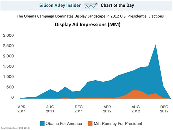
Check out the infographic below (originally on Business Insider), which is simple but tells us a lot about the dynamics of the online advertising race for the presidency in 2012:
Several points to note:
- The sheer volume of ads that Obama ran, compared with Romney. Not included in the chart: considering how much the Obama campaign used data to optimize its outreach, we can also assume that his digital marketers spent less than Romney per supporter-acquired.
- The “long tail” of Obama recruiting ads, starting back in August of 2011. As we discussed that fall, these ads were a key part of rebuilding the campaign’s email list and supporter base.
- The Obama “spike” of Get Out The Vote ad spending, which helped nudge his backers to the polls.
- Romney’s late start — very little advertising during the primaries, and list-building starting in earnest only in late summer. Why not begin running more ads once he had the nomination wrapped up? He was short on cash at the time, but even a relatively small investment in April/May would have at least started his list-building process.
- Romney’s LACK of a strong GOTV ad push. Did they really think they had the election in the bag? Skipping an online campaign to get GOP voters to the polls reeks of political malpractice.
- Note that Obama ran as many ads in August of 2011 as Romney did in August of 2012. Which one understood that online recruiting is incremental?
Thanks to Nathan Abse for sending over the chart — look for his new report on political data and microtargeting on the IAB site tomorrow.
– cpd


[…] ITEMS. E.politics, as usual, has several interesting items of note. This item notes online ad trends during the presidential […]
[…] views, to Mitt Romney’s 30 million. A ten-fold difference! What immediately comes to mind is the earlier comparison between Obama and Romney’s online ad spending…in which Obama again blew Romney out of the […]