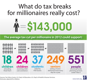
Infographics are all the communications rage these days, in part because of the visual emphasis of sites like Pinterest and the new(-ish) Facebook Timeline layout. But what makes a good infographic good? For a recent example, let’s use something from my day job: the National Women’s Law Center’s successful “What Do Tax Breaks for Millionaires Really Cost?” graphic, which was released soon before the Senate vote on the so-called “Buffett rule.”
Good Data
Data is the core of an infographic — without it, even a well-designed one is just a pretty picture. In the case of NWLC’s tax cuts infographic, the data was good for two reasons. First, it was accurate, which the organization emphasized with a lot of footnotes to sources on the image’s primary landing page. Second, it was relevant: it took an abstract idea (the opportunity cost of giving more tax cuts to a person who is already wealthy) and compared that number with government services people could relate to and see as important. One millionaire’s tax cut equals a daily meal for 249 senior citizens? Whoa.
Good Design
With the data in hand, design is the next consideration, and good design is really the whole point of illustrating information visually like this. The key is to make the data easy to grasp at a glance, and the NWLC graphic achieved this in two ways. First, through the use of little human figures to demonstrate how many people’s benefits would be offset by a single tax cut (one millionaire, naturally wearing a top hat = a lot of the rest of us). Second, the graphic set the different examples apart from one another with color — by using purple, red, orange and other distinct shades for the different numbers of people affected by each program, the designer (my NWCL colleague Beth Stover) created a visual presentation that’s easy to interpret in a few seconds. If it were more monochrome, the infographic would be harder to comprehend quickly — and probably, less successful.
Good Timing
The NWLC graphic caught the public debate around tax cuts for millionaires at a good time, hitting a nerve with people angry about constant talk of budget cuts without tax increases for people who’ve done well in the last decade or two. As a result, it was widely shared on social media even before NWLC began pushing it heavily — once it was first posted to Facebook, NWLC followers started started spreading the word on their own. To help, NWLC sent an email to followers asking them to post it on their social media channels and also reached out directly to bloggers, journalists and progressive organizations that work on social justice and economic issues. As a result, it formed the basis of blog posts, caught the attention of reporters and spread widely on Twitter. In a social media environment, sharability is key. It’s no surprise that the graphic did well on Pinterest!
Of course, even the best infographic is unlikely to either pass or defeat legislation on its own, but good ones can play a role in shaping the public discussion around an issue. They’re a classic example of an old communications rule: show ’em, don’t tell ’em. And as the internet becomes more of a visual medium, we should be seeing a lot more infographics. I’d bet good money that the successful ones will typically embody the rules above.
– cpd

