Updated below.
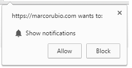
Unless you’ve turned off website notifications, here’s what you’ll see, in my case in the upper left corner:
A website notification box, oh my. You can actually see it in Firefox as well as in Chrome now, assuming your system is so configured, since a notifications feature went live for Mozilla’s browser earlier this year as well.
I learned about Marco’s use of browser notifications to alert followers to new content while talking with International Business Times reporter Kelly Flynn for an article about his campaign’s content-heavy approach:
[Wesley] Donehue runs his shop for Rubio like a newsroom, one in which they produce as much daily content as possible, thinking about the same clickbait headlines popularized by online media sites. Take a look at Jeb Bush’s website and you’ll see a post from Jan. 19 and Feb. 16. On Rubio’s site, the team is churning out blog post after blog post. By midday Saturday, there were already three posts dated Feb. 20, 2016.
Website content is an afterthought for most campaigns, and Rubio’s team seems convinced that a website-centric content-marketing approach will help land him in the White House. Epolitics.com is no stranger to thinking of political groups as new media newsrooms, either: Troy Schneider used those very words in a piece he wrote for us in 2007.
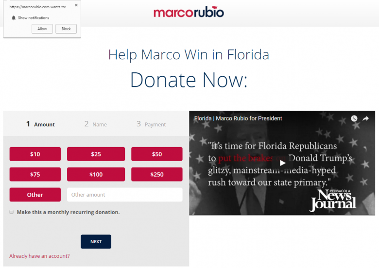
Website notifications at least SEEM like an innovative way to keep supporters engaged and motivated day to day. But dig a little deeper, and the downsides start to multiply. Since at least this weekend, Rubio’s site has automatically redirected visitors to the help-us-win-Florida fundraising page below:
See anything noteworthy? Oh yeah, that notification box. Which is at least as prominent as the fundraising ask, because it pops in over the content and draws attention to itself. But if the campaign is so focused on raising money to stay alive on Tuesday, why are they sticking such a relatively low-value action — with a long-term payoff, if any — in front of potential donors? Time for an A/B test to find out just how much the notification box cannibalizes actual donations…assuming it does, of course, which is something data can tell us
More broadly, every communication a campaign has with a supporter influences that person’s likelihood of acting on the campaign’s behalf in the future. Before I rolled something like website notifications out, I’d want to test it on a smaller group of people in some way to see if notifications actually help or hurt. Are people who receive notifications more or less likely to volunteer or to give money? I could see circumstances where too many notifications could burn someone out. Or, they might actually REDUCE the effectiveness of campaign emails sent at the same time, which are a digital team’s main money-maker. Plus, is writing blog posts really the best use of a digital staff? They might do more good by focusing on writing more emails and running more Facebook ads.
A certain digital campaigning ebook says it again and again: don’t do something online unless it has a good chance of helping your candidate win votes. It’s POSSIBLE that website notifications bind people to the candidate in a supple web of text, images, video and pure love. It’s also possible that they just get in the way of actions you REALLY need supporters to take…and if I were running a presidential campaign, I’d want to see the data. Otherwise, a digital team might just be committing malpractice without even knowing it.
– cpd
Update: My old New Media Strategies colleague Matt DeLuca weighs in on Twitter to say, “I think it’s a good idea but it’s probably worthwhile only to super volunteers — might make sense for a microsite/supporter site.” Exactly! A niche application that can be handy in some circumstances but distracting in others. The trick? Knowing which is which.


